Thursday, October 30, 2008

Nananananananana.... Bat-Manga!

Via BoingBoing:


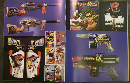
In 1966, manga prodigy Jiro Kuwata was commissioned to do a regular Japanese manga version of Bob Kane's Batman comics, to tie in with the Japanese launch of the Batman TV show. Kuwata quickly decided that Kane's scripts wouldn't play to a Japanese audience, so he remade the Dark Knight for the expectations of a mid-sixties, manga-familiarized audience. The result was stunning: a weird blend of genius suspense and gonzo weirdness, as villains turn into dinosaurs, commit strange crimes, rise from the dead, and rampage through a mangified Gotham City that has the streamlined wonderfulness of space-age Japanese pop culture.


These comics were lost for decades, but they have resurfaced now, recovered from private collections and reprinted in Bat-Manga, a new anthology from Pantheon edited by Chip Kidd. Kidd has supplemented the material with fantastic photo spreads (by Geoff Spear) of collectible Japanese Batman toys from the era. The reproductions themselves are only minimally cleaned up, leaving intact the yellowing paper, the wildly variable print-quality, the strange nostalgic quirks of printing from that era.

Tuesday, October 28, 2008

Ray Gun Patents from the 50s.


Wonderful collection of 1950s-era toy ray gun schematics from the US Patent Office.  These would look super-cool printed up on parchment and framed.  Check out their other collections, too.


Monday, October 27, 2008

Be Like Don Draper.


Don Draper's Guide to Picking Up Women.

Thanks, Jim.

Wednesday, October 22, 2008

A Font We Can Believe In.


Unless you’ve been avoiding television, newspapers, and all other forms of mass media for the past few months, you’ve probably seen Democratic presidential candidate Barack Obama’s “Change We Can Believe In” and “Stand for Change” banners. The typophiles among you may have realized that the “change” font Obama’s campaign uses is Gotham, designed by Hoefler & Frere-Jones, originally as a commission for GQ Magazine.


Jonathan Hoefler and Tobias Frere-Jones spoke about the creation of Gotham during their interview for Helvetica the film, and looking back at their description of what GQ wanted from the font, it sounds surprisingly Obama-esque. “GQ had a dual agenda of wanting something that would look very fresh, yet very established, to have a credible voice to it,” says Hoefler. It also needed to look very masculine and “of-the-moment.” 

Mission accomplished.


The conversation about the origins of Gotham didn’t make it into the film, but was included among the 41 bonus features on the Helvetica DVD. I’ve posted part of the interview above. Watching this clip, I think it’s interesting that the design of Gotham was influenced by early Modernism, another movement that was about change and social idealism. And I like that the design aesthetic that may help move Obama into the White House was inspired by the humble NY Port Authority Bus Terminal sign.

*                   *                   *

Are you now curious where the other campaign fonts come from?  Check out this LA Times piece.

Faux Disney Attraction Posters.


Artist Greg Maletic created these faux, retro-style posters emulating the silk-screened look of the early Disneyland attraction posters (a design I love enough to have prints of the Haunted Mansion, Submarine Voyage, and Monorail hanging in my bedroom).  He's got a great story, too--apparently Disney execs saw these posters, and hired him to do it for real.

Saturday, October 18, 2008

Jules Verne Festival


The Jules Verne Festival, Oct 23-25, in downtown LA.  Movies screening at The Edison and the Imaginasian Center (Yeah, I've never heard of it either.  But "Imaginasian" sure is fun to say) include personal favorites 20,000 Leagues Under the Sea, Superman: The Movie and Superman II, and Planet of the Apes.  Looks like they're also honoring Roy Disney, as well as Battlestar Galactica showrunner Ron Moore.

Truthful TV Title Cards.

Adam points to these truthful TV title cards, boiling each show down to its essence:


More after the jump.

Thursday, October 16, 2008

Wristwatches of War.


Pocket watches were a pain in the ass to fumble around for during battle, something needed to be done to keep soldiers hands on their guns as well as synchronize combat.

"When German Emperor Wilhelm I visited the Berlin Trade Fair and saw some experimental wrist watches made by Girard-Perregaux of La Chaux de Fonds in Switzerland. He gave an order for 1,000 of these for the German Imperial Navy, and as many as 2,000 such wristwatches were delivered in 1880. This began to change in the nineteenth century when watches were first used to co-ordinate military operations. Pocket watches were awkward to use in combat situations; under a great-coat, on horseback, or under fire, and so military men began fitting pocket watches into cups on specially made leather straps, or asking manufacturers to fit them with chains or straps, so that they could be worn on the wrist."
Many military watches had a special feature for those "in the shit." A "trench guard," (or "grid" or "grille") covered and protected the dial with medieval-style armor. Those not intended for war were classified as "hunter" cased, often more decorative than protective.

Tuesday, October 14, 2008

Battlestar Galactica Propaganda Posters.


ThinkGeek is selling this set of 5 Battlestar Galactica posters, inspired by Russian propagandist imagery. Show your support in the war against Cylon terror.


Friday, October 10, 2008

Robot Papercrafts


Here's a ton of retro-style robots for you to fold and construct, so you can build a papercraft army to defend your desk from world domination.

The site's in Japanese, but pretty simple to navigate, and the patterns are free to download.  Click on the image of the robot you want, then the underlined link, then the PDF file.  Then just print it up, cut it out, and glue it together.  

Thursday, October 9, 2008

Ray Gun, #001.


Superman Krypto-Raygun, Daisy Mfg. 1940s.

Wednesday, October 8, 2008

More Bass.


I haven't been to the movies in a while, which is probably why I haven't seen this Burn After Reading poster.  I feel like I've seen this style somewhere else... kind of like the same way Jimmy Stewart, in Hitchcock's Vertigo, sees Kim Novak as Judy, but she reminds him so much of Madeline... Gosh, I wish I could remember, where have I seen this style before?

Cool Business Cards, Parts 1 and 2.


I've been thinking about redesigning my business card lately.  These designs are inspiring.

Cool business cards Part 1 and Part 2.

Tuesday, October 7, 2008

Mad Men Illustrated.


Brandon just sent me a link to this wonderful Flickr gallery of artwork based on the most stylish show on tv, AMC's Mad Men.  Artist Dyna Moe:

I'm basing the look on (but don't come within one iota of the amazingness of) illustrators Aurelius Battaglia, Alice & Martin Provensen, and J. P. Miller (among others) who did advertising and commercial art during the era the show is set. 

I'm sure Shag is one of her influences, too.

More Saul Bass.

Most of my friends have seen these already, but it makes a nice companion piece to yesterday's posting; specifically the Star Wars posters redone in a Saul Bass style. Here's the credit sequence for Star Wars that never was:

Saul Bass v. Star Wars


Saul Bass v. Star Wars: Special Edition

Monday, October 6, 2008

Saul Bass-Inspired Movie Poster Remixes.


Artist Tom Whalen makes new posters for old movies.  Heavily inspired by the original poster master Saul Bass -- as well as Russian constructivist poster art, comic books, and his "unhealthy obsession with Japanese monster movies" -- these are truly a sight to behold.


I love, love, LOVE this technique.  Simple, bold, and effective.  I feel that Saul Bass, propaganda posters, and comics heavily influence my graphic design work, too... maybe I'll try to do a Superman: The Movie poster in this style as a side project.

Visit Tom's Portfolio, his Design Blog, and this article /Film did about him (and dig that Dawn of the Dead poster!)

Sunday, October 5, 2008

A More Civilized Age.

Train Ride to the Beach?

A Pacific Electric Red Car atop a steel bridge above Fletcher Drive in Atwater Village, Los Angeles, California.

My neighborhood, a long time ago.  

Bacon-Infused Bourbon.


That's right. You heard me. Bacon. Infused. Bourbon. Watch Don Lee of PDT in NYC's East Village put a new twist on an Old-Fashioned. If bourbon's not your style, try bacon-infused vodka instead.

Star Wars Papercrafts


Could there be a more fitting first post? Beautiful, fantastically detailed Star Wars Papercraft models at this site.  I don't see an X-Wing (booooooo!), but they do have a certain time-traveling DeLorean... so we'll call it even.  Anyway, just print them up, cut them out, and tape 'em together.  Luckily, the Japanese instructions aren't too hard to figure out.

Cleared for Launch!

Welcome to my new blog!  I decided to open up a space where I can take interesting things I find (or should I say, things I find interesting?) and share them with other people.  Hopefully, you'll find them interesting, too.